The Brief
Kyle of Ace Wraps needed to portray his services to passers-by.
(He won’t mind me sharing his name publicly).
So he got in touch with me to help him design some signs.
The design needed to be in-keeping with his branding:
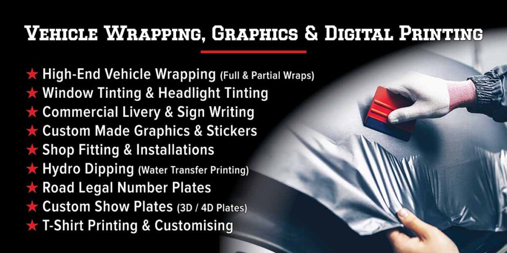
- He supplied me with his custom-made ‘National Champion’ typeface which I used for the titles.
- I used his signature black, white, and red colour scheme.
- I incorporated the 5 pointed stars which are a part of his graphic profile.
- The designs across all 3 boards had to have a consistent layout.
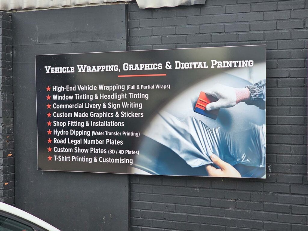
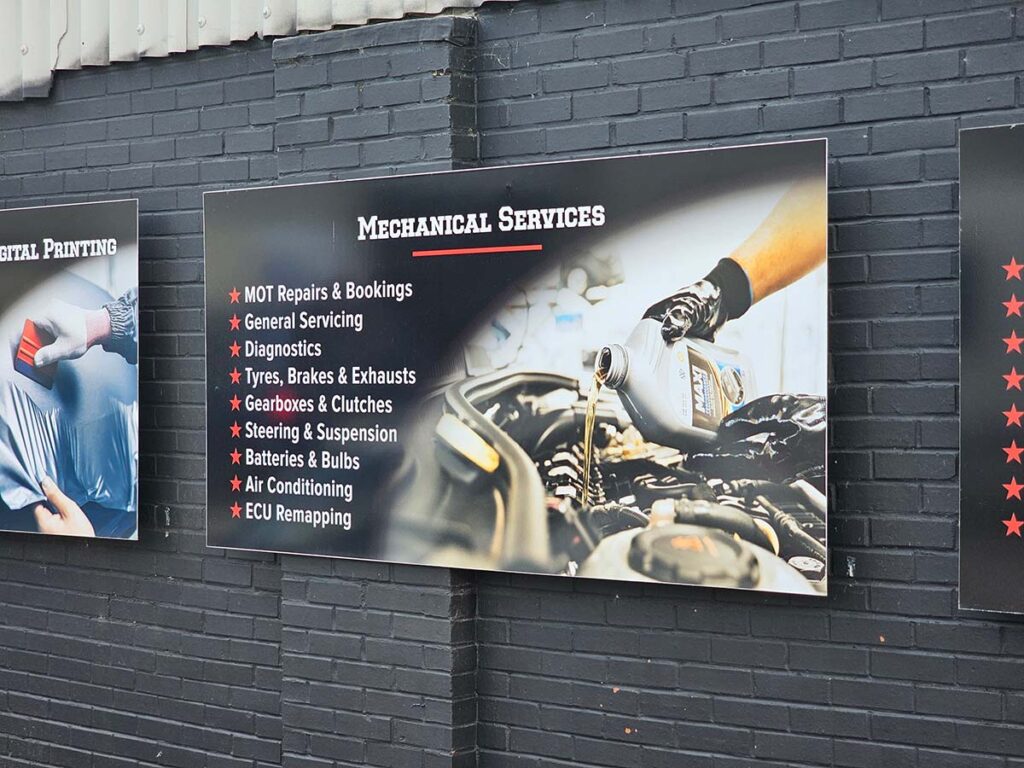
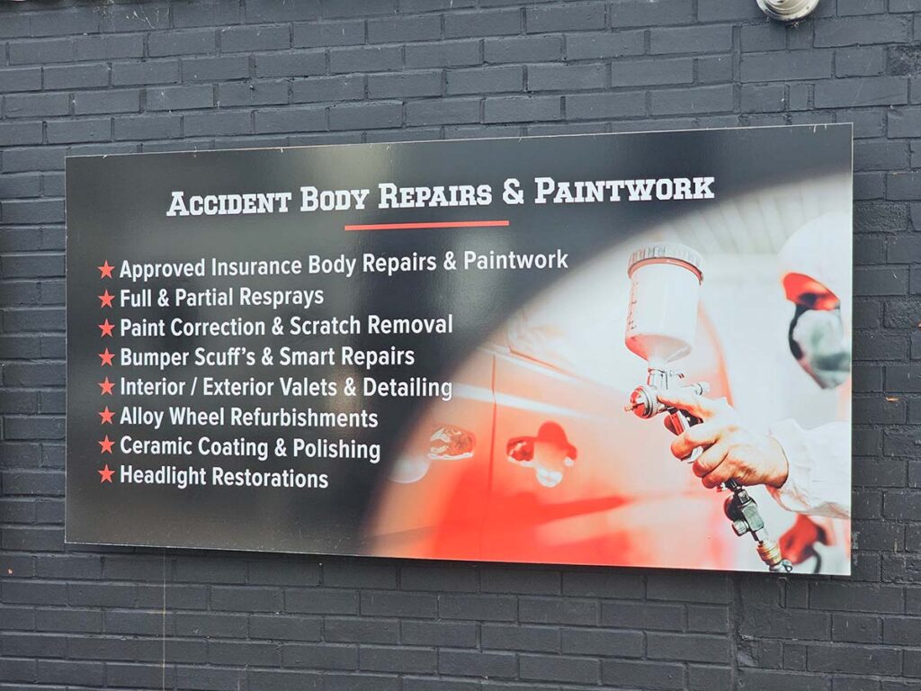
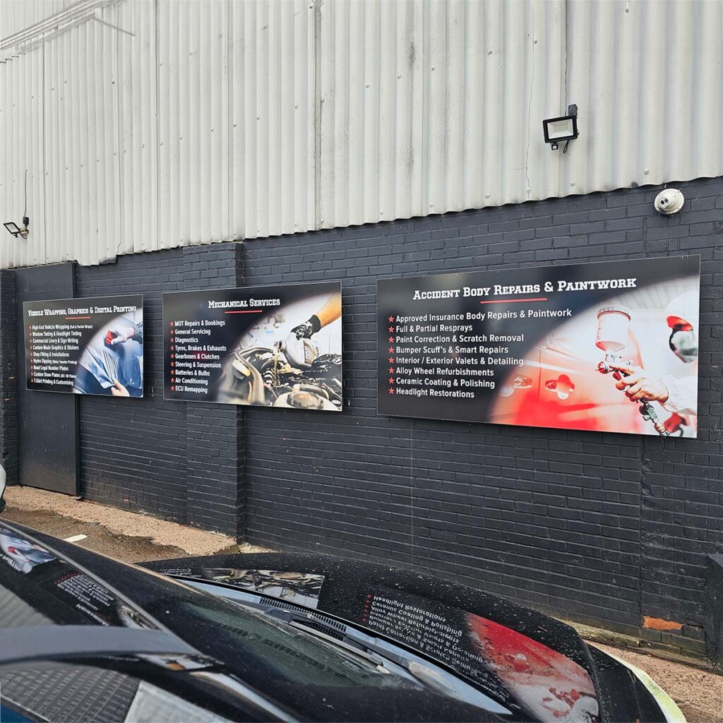
The Design
Even though these boards would be UV laminated, I wanted to help the black background to last whilst also being as visually deep and rich as possible, so I filled it as 4-colour black.
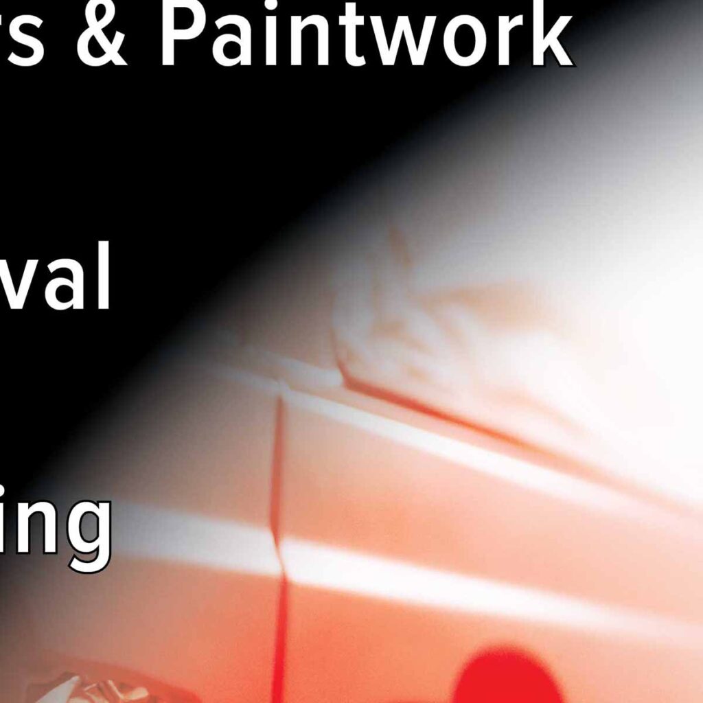
On these boards, there had to be some illustrative stock photos next to the rich black background, and I wanted to graduate the black over the photos for a nice aesthetic.
To preemptively avoid the awful brownish consequence of cyan, magenta, and yellow bleeding onto the photo, I made the gradient only a single colour black.
So now, as the gradient overlapped the photos, the colours of the photos were also maintained:
The Proofs
He supplied a photo with an indication of where the boards would go:
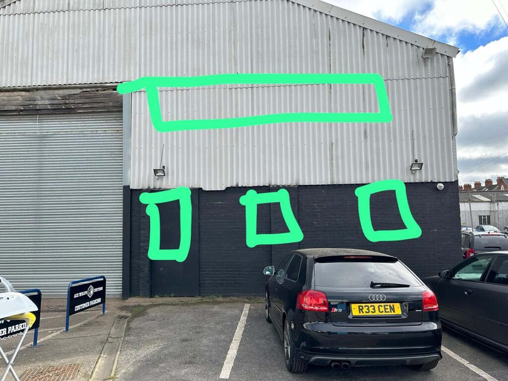
As a shop fitter himself, I was happy for him to supply the measurements required for the boards.
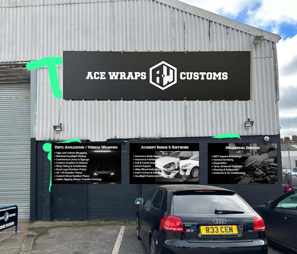
I put together a rough draft and sent it over for him to visualise:
The Print Files
The files were ready to print:


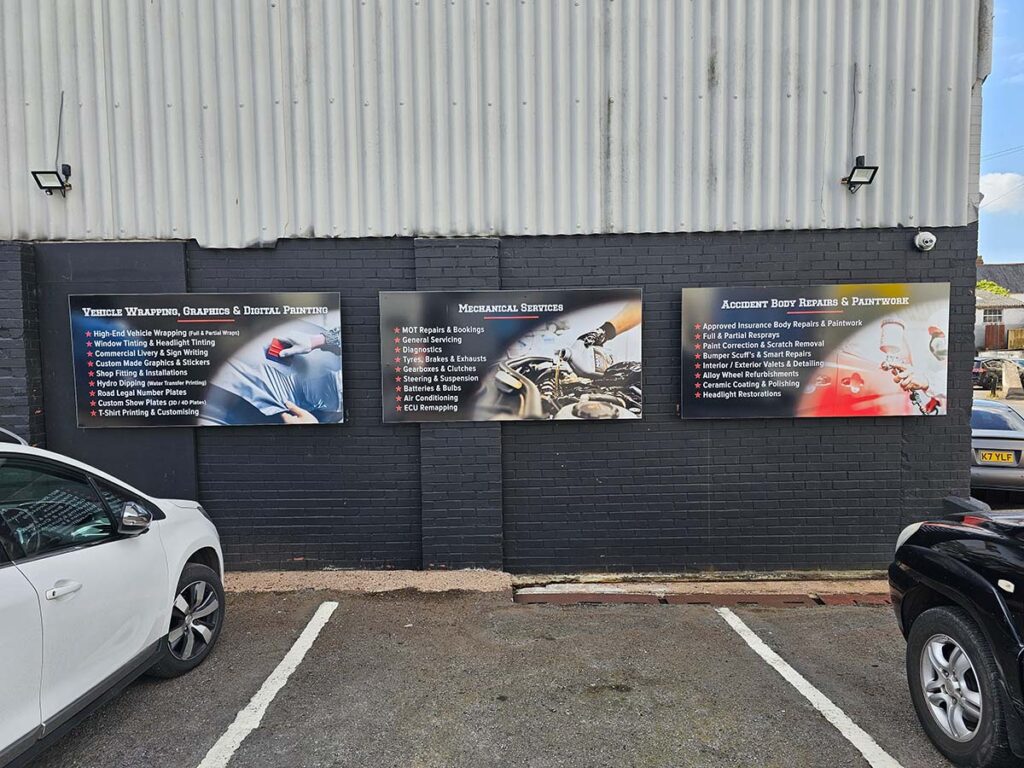
The Final
Kyle was very happy with the end result: